Material 3 Expressive is generating a lot of buzz in the Android community right now. Opinions are split, with some users loving the fresh new look and others finding it a bit overwhelming. Personally, I’m excited about what this update will bring, especially for Pixel devices, which have felt a little plain compared to other UIs like Samsung’s One UI. Material 3 Expressive introduces splashes of color, bouncy animations, and blur effects, giving the interface a fresh vibe without completely overhauling what we’re used to.
We’re nearing the full rollout of Material 3 Expressive, expected around September, likely in Q4. There’s also hope it might launch alongside the Pixel 10 series, although nothing is confirmed. Some of the changes are already rolling out via Google Play Store updates, so you don’t always have to wait for a major Android release to see improvements. Below, I’ll walk you through my five favorite redesigns coming with Material 3 Expressive and why I think they’re worth getting excited about.
1. A Fresh New Look for the Phone App
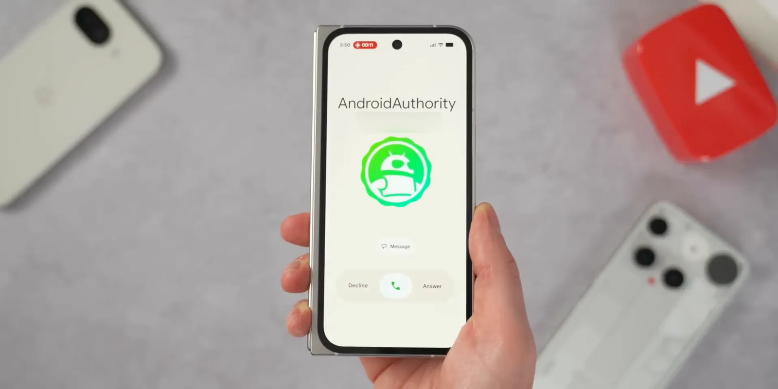
The revamped Phone app is probably my favorite change so far. The current dialer works fine but feels a bit basic and overdue for an update. Google’s redesign brings a cleaner, more organized look to call logs and favorites. Instead of tabs at the bottom, favorites are now highlighted in a banner at the top, making navigation clearer.
One of the biggest changes is how incoming calls are handled. Instead of the traditional buttons, you can now swipe at the bottom of the screen to answer or decline calls. This gesture-based control is already rolling out to some users via a Google Play Store update, so you might see it on your phone soon.
If you’re not a fan of swiping to answer or decline, Google has thoughtfully included an option in settings to revert to the old button style. During calls, the decline button has also been redesigned to a larger, pill-shaped button, making it easier to end a call quickly.
2. Quick Settings Get a Subtle but Impactful Upgrade
Quick Settings are something we interact with multiple times a day, so their redesign is a big deal. If you’re running the Android 16 QPR beta, you might have already spotted these changes. The colors of active toggles now better reflect your home screen’s color theme, making it easier to tell at a glance what’s turned on. For example, WiFi will show a deeper, darker green when active.
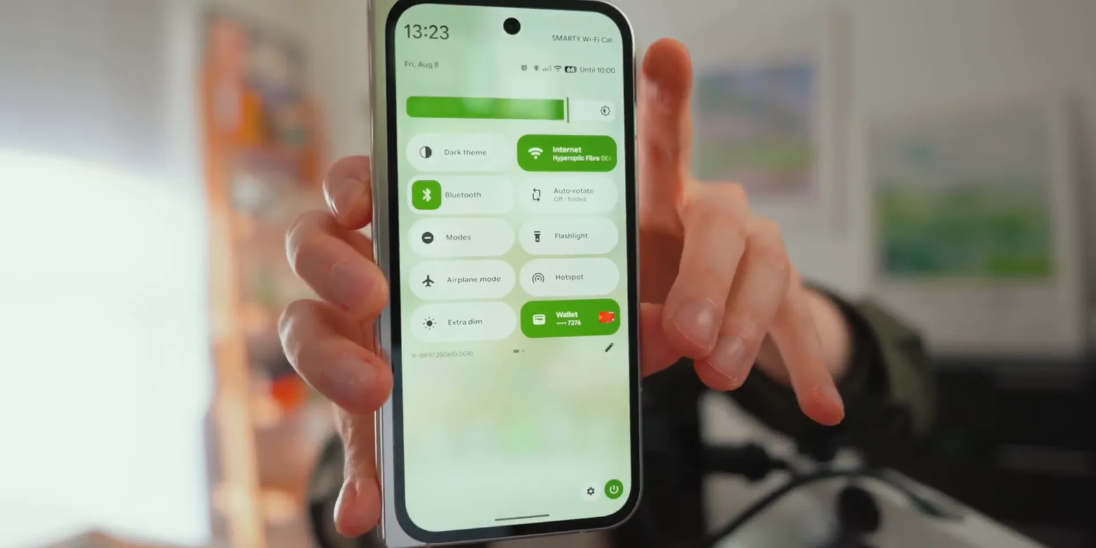
The notification panel background now features a slight blur effect, allowing you to see a hint of your wallpaper behind it. This is a welcome upgrade from the plain white background in Android 16, giving the UI more depth and personality.
Other notable tweaks include a more boxy brightness slider with a handle for easier adjustment, smaller and more pill-shaped quick setting panels, and the ability to display two rows of five toggles instead of four. Panels are also resizable during editing, allowing you to shrink them for quicker one-tap toggling—like instantly switching off Bluetooth without opening the full settings.
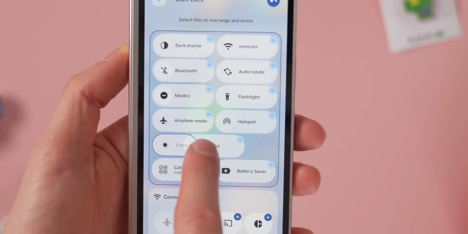
This refinement adds a bit of flair while maintaining familiarity, which I think is a smart move by Google.
3. Messages App: A Bold and Colorful Redesign
The new Messages app redesign has been controversial. While we haven’t seen a fully working version yet—only screenshots and concept visuals—it’s clear Google is drawing inspiration from popular messaging platforms like iMessage and WhatsApp. The interface will feature big, colorful bubbles that change depending on your Pixel’s theme colors, ranging from blue and purple to black and orange.
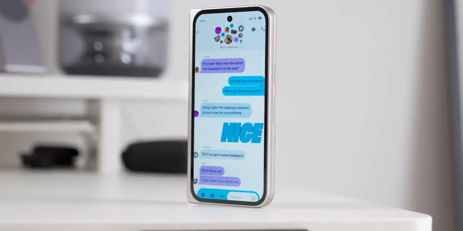
This bold, “in your face” style is a departure from the current minimalist look, and I get why some people might find it a bit much. However, it definitely adds personality and fun to the messaging experience. I expect Google will tone down some elements before the final release, which is anticipated in the Android 16 QPR update.
4. Clock App Overhaul: Bigger, Bolder, and More Intuitive
Believe it or not, the Clock app is getting a significant makeover, and it’s one I didn’t expect to get excited about. The alarm setting interface has been revamped with large rounded buttons and a prominent display of the time, making it easier to set alarms quickly.
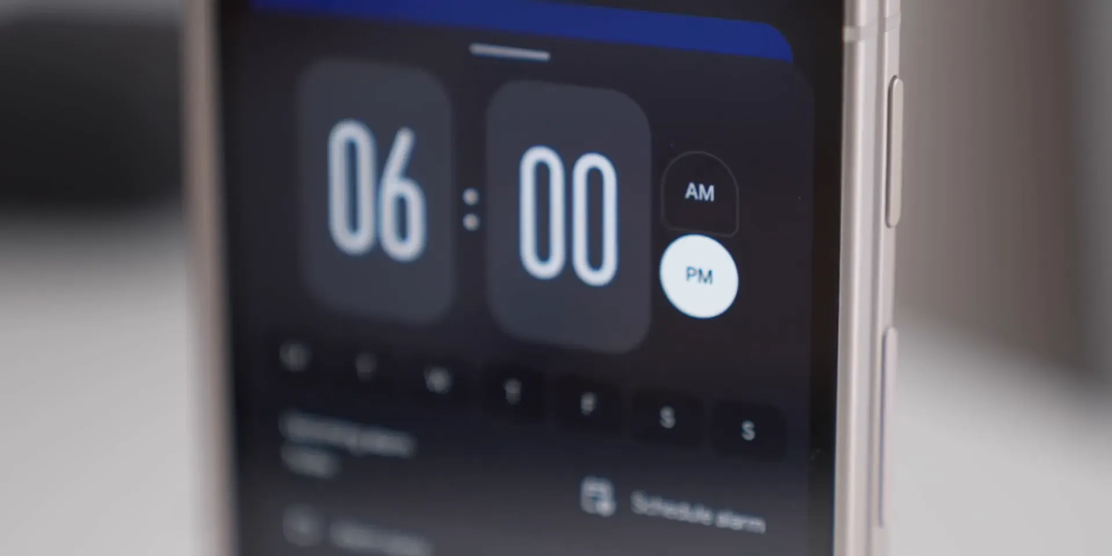
The AM/PM toggle has been redesigned for better visibility. When viewing your list of alarms, the entire alarm card is now highlighted when active, replacing the small toggle switch used previously. This change makes it much easier to see which alarms are turned on at a glance.
When an alarm goes off, the old swipe gestures to snooze or stop have been replaced by two large, obvious buttons. Interestingly, this is a contrast to the Phone app’s newly introduced swipe controls—here, Google has removed the swipe gesture entirely for clarity and ease of use.
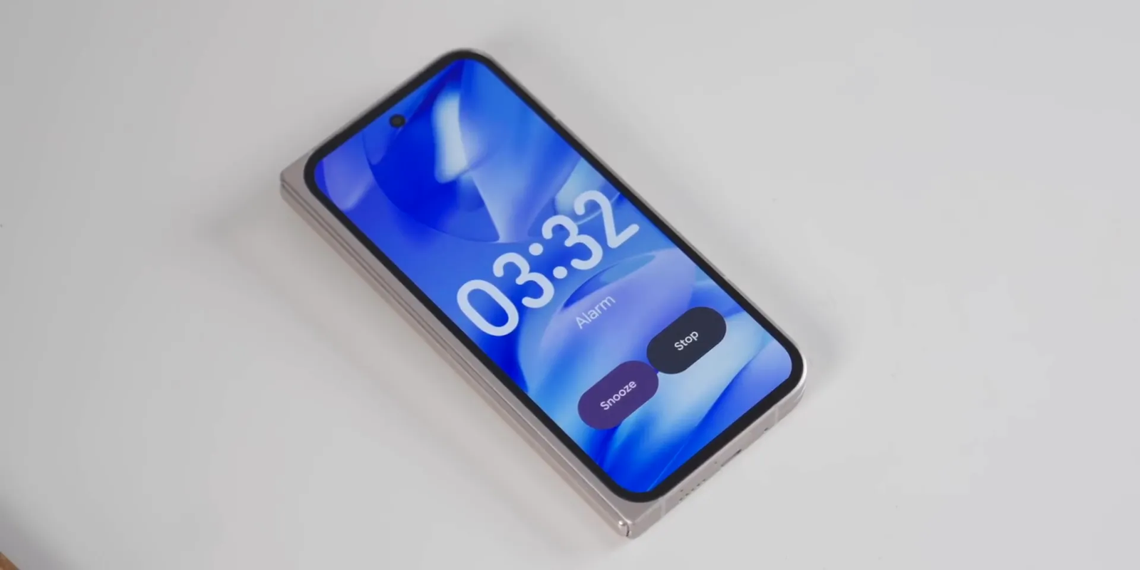
The upgrades extend to the stopwatch too, with bigger fonts and UI elements that match the overall Material 3 Expressive style. Overall, the Clock app feels more polished and user-friendly.
5. Gemini Gets a More Lively Activation Animation
Gemini, Google’s multitasking feature, is also getting a small but noticeable update. The current slider activation from the bottom of the screen will be replaced with a bouncier, livelier animation that brings Gemini to life in a more playful way.
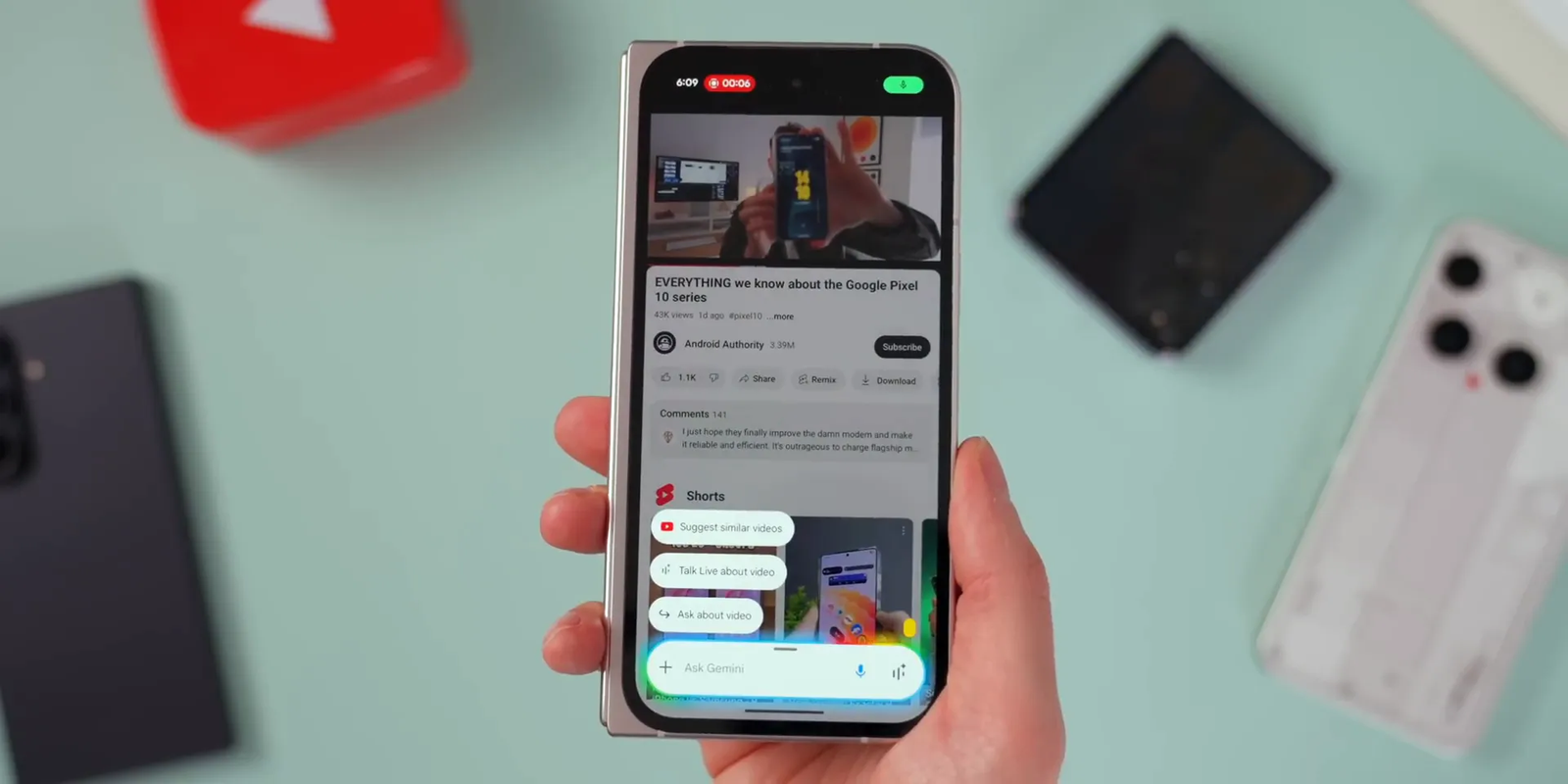
Additionally, Gemini will start showing contextually relevant actions based on what’s on your screen, with new rounded buttons that match the quick settings aesthetic. This makes it faster and easier to accomplish tasks you activated Gemini for, streamlining your workflow.
What’s Next for Material 3 Expressive?
These are just a few of my favorite updates from Material 3 Expressive. If you’re using the Android 16 betas, you’ll already see some elements sprinkled across Google apps. More redesigns are on the way, including updates to the Photos app and video editing features.
One interesting addition is the new Now Playing bar on Pixel lock screens. While I initially liked it, some users have pointed out it can be a bit confusing as it resembles media control toggles. Thankfully, Google is still refining the design ahead of the final release.
Many of these updates, like the Phone app redesign and incoming call screen, are already confirmed and coming through Google Play Store updates. This means you won’t necessarily need a full Android upgrade to start enjoying them. However, the revamped Quick Settings will likely arrive with the Android 16 QPR update later this year.
If you’re adventurous, you can try the beta builds now, but keep in mind that betas sometimes have bugs or incomplete features, especially for UI changes. For most users, waiting for the stable release might be the best option.
Final Thoughts
Material 3 Expressive is all about injecting more personality, color, and fluidity into Android’s user interface. While not everyone will love the bold new designs—especially in Messages—the update brings welcome freshness to Pixel devices and Google apps overall.
From the playful swipe gestures in Phone, the refined Quick Settings, to the vibrant Messages and Clock apps, Material 3 Expressive offers a balanced mix of subtle refinements and eye-catching redesigns. I’m genuinely excited to see these changes roll out fully and how they’ll enhance the everyday Android experience.
What do you think of Material 3 Expressive’s big, bold redesign? Is it a refreshing change or a bit too much? Feel free to share your thoughts!


Leave a Reply